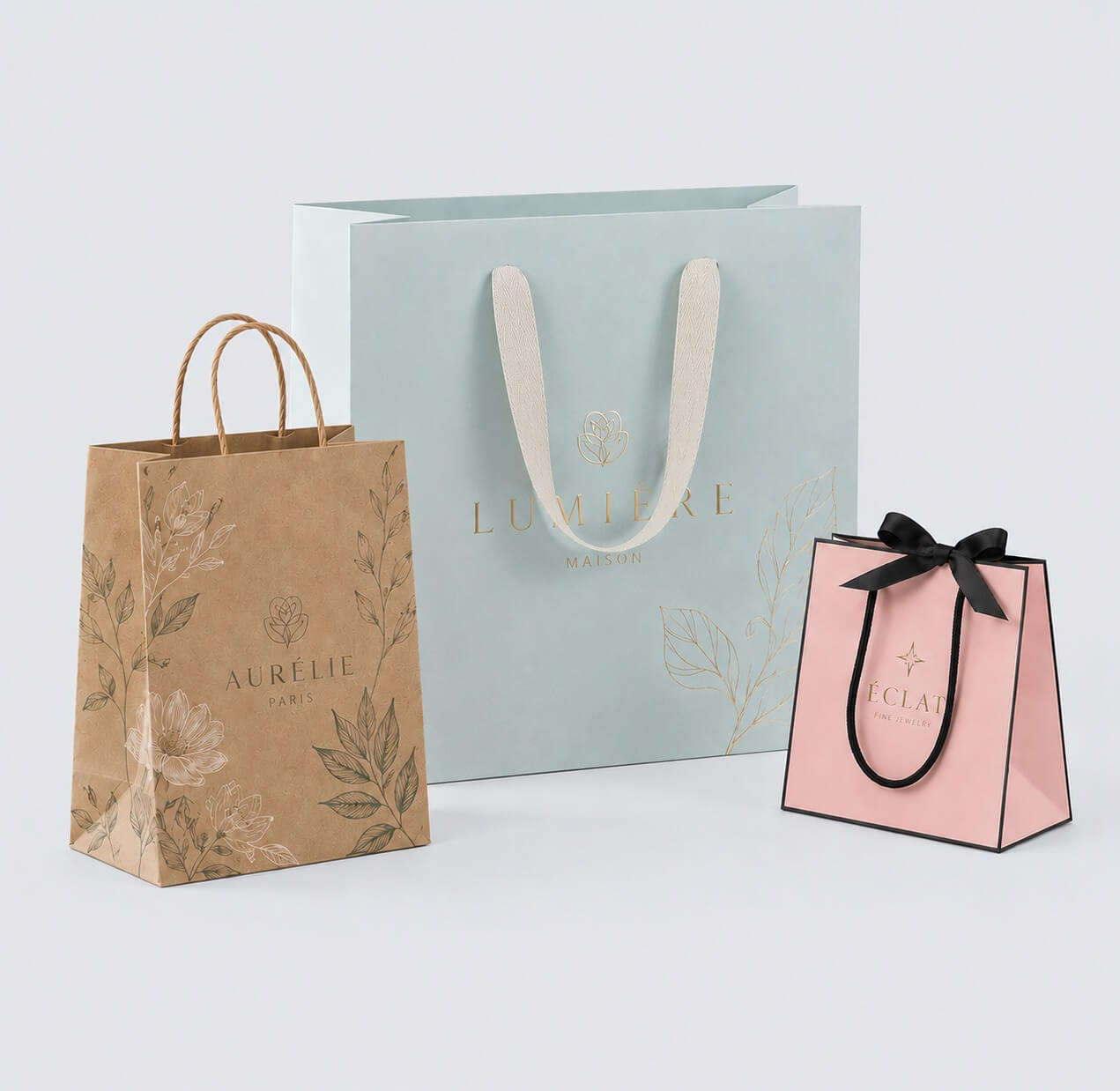

Premium packaging is easy to recognize but surprisingly difficult to define. A box may use thick board, metallic foil, embossing, and a soft-touch surface yet still feel ordinary. Another may rely on a simpler structure, one carefully selected paper, and very little decoration but immediately feel more considered.
For brands developing custom packaging , the difference rarely comes from one expensive feature. Premium perception is created by several details working together: proportion, material, structural behavior, surface quality, product presentation, and manufacturing consistency. The strongest packaging does not try to prove that it is expensive. Its quality feels intentional.
This principle applies across folding cartons , drawer boxes , rigid gift boxes, 2 piece boxes, and more specialized constructions. The structure may change, but the package still has to look balanced, feel appropriate in the hand, and behave correctly when it is opened.
Premium Is First Judged Visually
Before a customer touches the package, proportion has already started shaping the impression. The relationship between width, height, and depth matters, as does the depth of a lid, the amount of space around a logo, the position of typography, and the balance between printed areas and empty space. Customers may never consciously measure these details, but they can usually sense when a package looks too crowded, too heavy, or poorly balanced.
Consider a two-piece rigid construction. Increasing the board thickness or adding foil will not correct a lid that looks disproportionately deep compared with the base. The same applies to custom telescopic boxes and custom telescoping boxes: the relationship between the lid and base has a strong visual effect before material or finishing is even considered. A custom tray and sleeve box creates a different impression again because the outer sleeve, inner tray, and visible opening area have to feel proportionate to one another.
Artwork follows the same principle. A large logo is not automatically cheap, just as a small centered logo is not automatically luxurious. What matters is whether the artwork has a clear hierarchy and enough room to work with the dimensions of the package. This is one reason many successful premium packages appear relatively restrained: removing unnecessary visual elements gives the material, structure, typography, and product more space to establish their own character.
A good example is a Luxury Folding Carton Box . Its premium quality does not have to come from making a folding carton imitate a rigid box. Good proportions, controlled printing, appropriate board, and a carefully chosen finish can create a refined result while keeping the structural advantages of a folding carton.
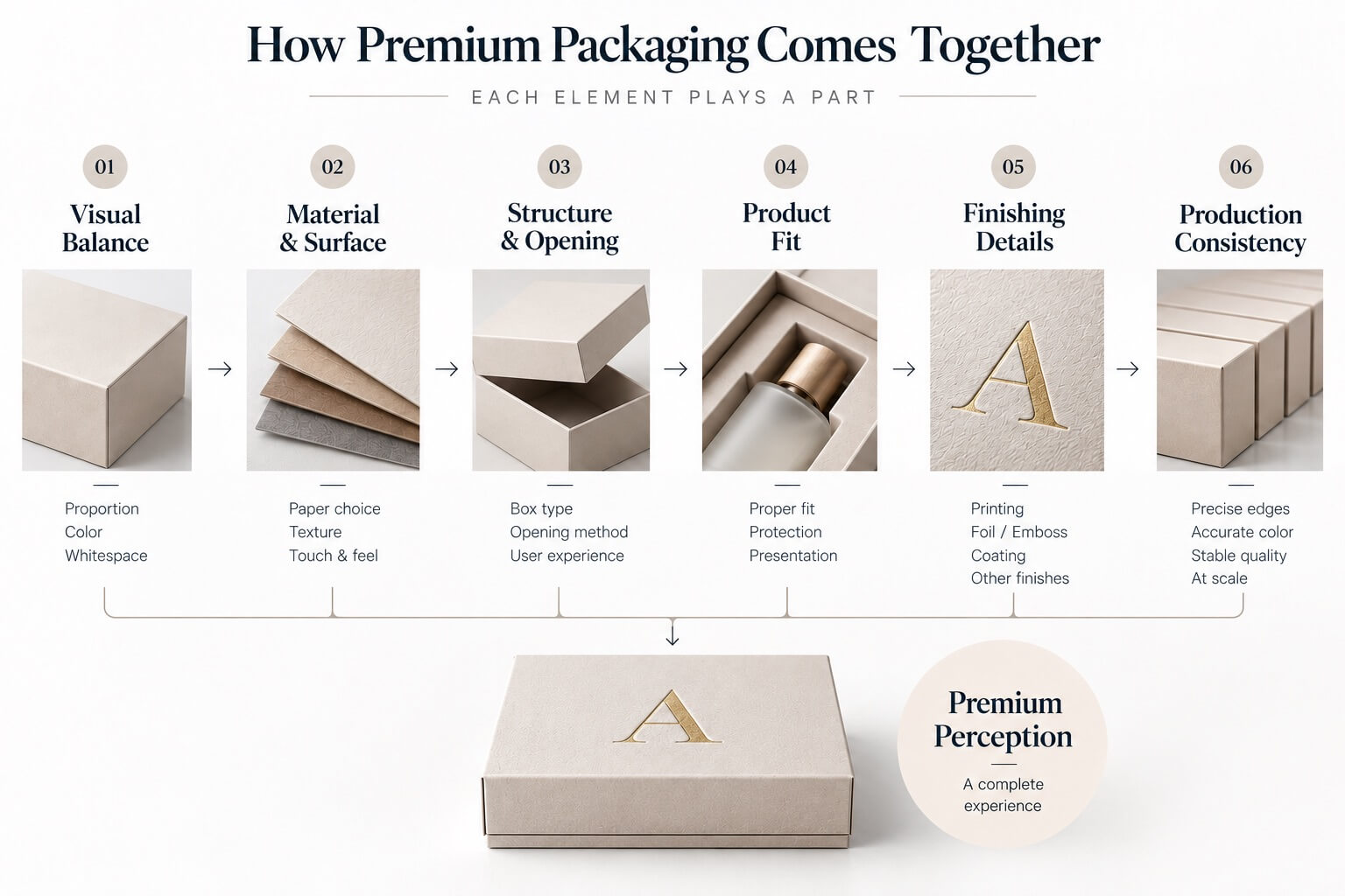
Material Changes the Perception Once the Package Is Held
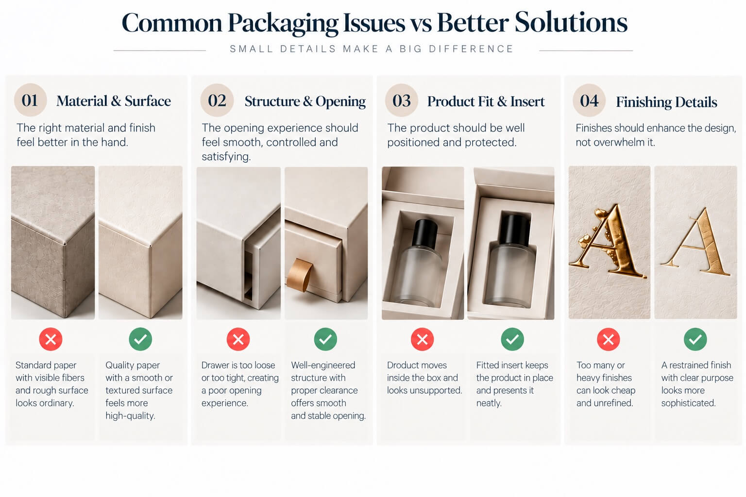
The next judgment happens through touch. Customers may not know whether a carton uses a particular grade of paperboard or specialty paper, but they notice stiffness, surface texture, weight, and how the material responds when handled. A smooth coated surface communicates something different from an uncoated sheet with visible fiber character, while a subtly textured wrapping paper creates another type of experience.
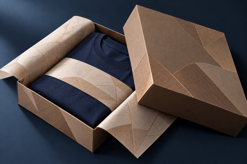
Material therefore needs to support both the structure and the brand. For luxury cosmetic packaging boxes, a high-quality white paperboard with accurate printing and clean folds may be more appropriate than a much heavier construction. Fragrance or gift packaging may benefit from a rigid structure when additional dimensional stability and a more substantial opening experience are important. With luxury apparel boxes, proportion, surface character, and opening area may contribute more to perceived quality than simply increasing board thickness.
More material is not automatically more premium. A board that is unnecessarily thick can make a small package bulky, while heavy lamination may hide the natural character of an otherwise attractive paper. An expensive specialty paper can also lose much of its value when paired with weak artwork, inaccurate wrapping, or poor edge quality.
Do expensive packaging materials always look more luxurious?
Not necessarily. Better materials can improve tactile quality, stiffness, and surface appearance, but they cannot compensate for weak structural or production decisions. This matters particularly for luxury packaging for small business, where upgrading every component is rarely necessary. When budgets are controlled, improving a highly visible or frequently touched element—such as the outer paper, printing quality, or structural fit—can create more perceived value than adding several decorative finishes at once.
Material should be selected because it improves the package, not simply because it costs more.
Structure Determines How Premium Quality Behaves
Once the package is handled, quality becomes less visual and more physical. A lid is removed, a drawer is pulled, a folding carton is opened, and eventually the product is taken out. Those movements are part of the packaging experience, and structural weaknesses that were invisible in a rendering often become obvious as soon as the package is used.
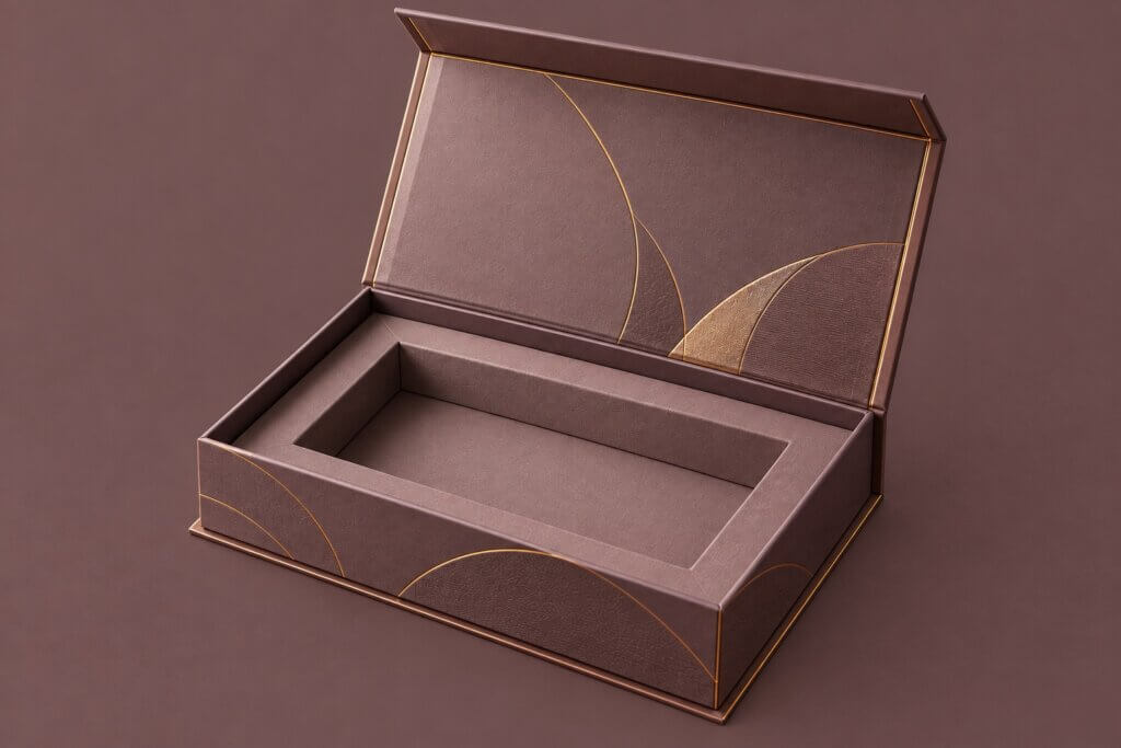
A well-engineered drawer should not slide out unexpectedly, but it should not require excessive force either. A lid-and-base box needs enough clearance to open consistently without obvious lateral movement. A folding carton should retain clean geometry around the product rather than bowing or distorting because the internal dimensions are wrong. As discussed in how to choose the right box structure , structural development should begin with the product, its weight, dimensions, protection requirements, and method of use—not simply with the appearance of the box.
Special structures can create a stronger opening experience, but only when the mechanism supports the product. A Double Door Perfume Box , for example, can use symmetrical opening panels to create a staged fragrance presentation. The perceived value comes not only from the unusual form, but from how accurately the doors align, how the interior reveals the bottle, and whether the structure remains stable during repeated opening.
This is also why a rendering cannot fully validate premium packaging. It can communicate color, graphics, and approximate proportions, but it cannot show how much resistance a drawer has, whether a lid fits consistently, whether a carton deforms after loading, or whether the customer can remove the product comfortably. Those questions usually need to be evaluated through a physical prototype.
Does a rigid box automatically feel more premium than a folding carton?
Not necessarily. Rigid boxes can provide greater stiffness and a more substantial presentation, making them suitable for many premium gift, beauty, and fragrance applications. But when the product does not require that level of construction, a well-designed folding carton with excellent paper, printing, and dimensional control can look more appropriate and equally refined.
Premium structure is not the heaviest or most complicated structure available. It is the structure that feels appropriate for the product.
Product Presentation Begins After the Box Opens
The outside of a package creates expectation, but the inside has to confirm it. A product that rattles inside an oversized cavity, leans to one side, or sits too deeply in an insert immediately weakens the impression established by the exterior. This is why inserts should be considered part of the presentation rather than simply a component used for protection.
Insert height determines how much of the product remains visible, while the clearance around a bottle or jar influences whether the placement looks deliberate. Finger access affects whether the product can be removed naturally, and multiple compartments determine how accessories are organized and whether the composition still looks balanced when the package is opened. For luxury cosmetic packaging boxes, this becomes especially important when bottles, jars, tubes, applicators, and accessories need to appear together as one controlled presentation.
The same thinking applies to luxury soap boxes, apparel, electronics, and influencer gift boxes. Influencer and PR packaging often needs to present several components at once, so a larger box alone is not enough. The internal arrangement needs a clear hierarchy: the main product should be immediately recognizable, secondary items should remain organized, and everything should stay in position after transport.
Making the outer box larger simply to create more physical volume does not necessarily increase perceived value. Excess empty space can make the product appear smaller while increasing paper consumption, insert size, packing volume, and shipping space. Good product presentation is usually about proportion and precision rather than scale.
Finishes Should Reinforce the Design, Not Compete With It
Only after proportion, material, structure, and product presentation are working together does finishing become truly useful. Foil stamping, embossing, debossing, spot UV, matte lamination, gloss surfaces, and other processes can all contribute to premium packaging, but each should have a reason to be there.
Foil can establish a reflective focal point. Embossing and debossing introduce physical depth. A matte surface can reduce reflection and change the tactile character of the package, while selective gloss can create contrast without introducing another printed color. These effects solve different design problems, which is why simply increasing the number of finishes rarely improves a package in a predictable way.
A restrained foil logo on an otherwise quiet surface can be powerful because there is little competing for attention. A blind deboss on textured paper may work for the opposite reason: instead of adding another material or color, it allows light and physical depth to create the detail. The same thinking can extend beyond the box itself. A Luxury Ribbon Handle Paper Bag can support a premium retail or gifting experience when the paper, handle, proportions, and finishing feel consistent with the primary package rather than appearing as an unrelated add-on.
If foil, embossing, spot UV, gloss, patterns, ribbons, and another metallic element are all used simply because they are available, the package can begin to feel less controlled rather than more premium. A more useful question is therefore not “Which premium finishes can we add?” but “What is missing from the current design?”
If nothing is missing, another finish may not be necessary.
Why Can Black and Gold Packaging Still Look Cheap?
There is no universal luxury color. Black, gold, deep burgundy, navy, ivory, and other restrained palettes are common in premium packaging because they can create strong contrast and controlled visual environments, but color alone does not create quality.
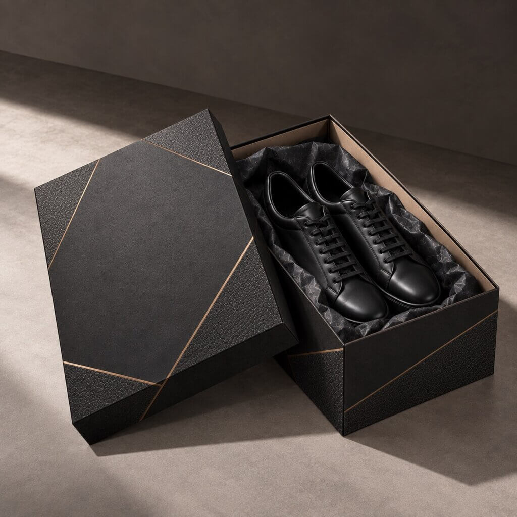
Black glossy gift boxes are a useful example. Large dark surfaces can make scratches, dust, imperfect edges, uneven reflection, and inconsistencies between materials more visible than they would be on a lighter package. A high-gloss surface attracts even more attention to those details because the surface itself becomes part of the visual effect. Gold presents a similar challenge: a small metallic detail can establish hierarchy, while extensive metallic decoration combined with gloss, complex patterns, several typefaces, and multiple colors can quickly lose the restraint the finish was intended to create.
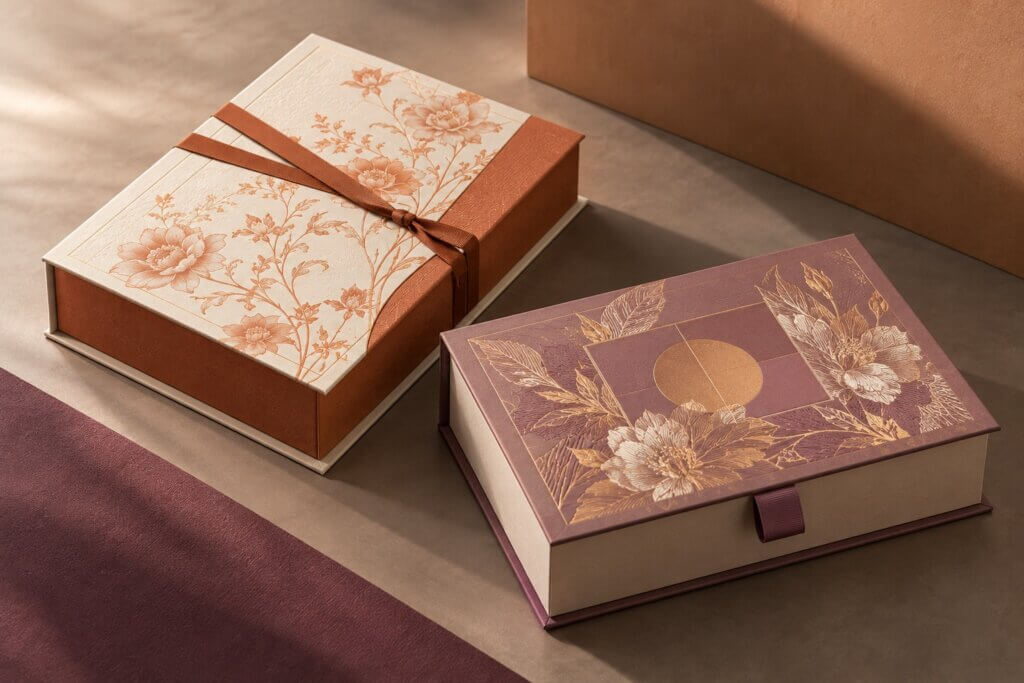
Premium packaging therefore does not have to be black, gold, or even dark. Cosmetics, fragrance, wellness, apparel, and lifestyle packaging can use pale blue, green, warm white, orange, red, or more expressive palettes successfully when the color supports the brand and can be reproduced consistently.
The better question is not which color looks expensive, but whether that color works with the material, product, and manufacturing process.
Manufacturing Consistency Is Where Premium Packaging Is Proven
At this stage, the design may look balanced, the material may feel appropriate, the structure may open correctly, and the finishes may be restrained. There is still one final test: production. Customers notice inconsistencies even when they cannot name the manufacturing process behind them. They see when corners do not align, when wrapping paper lifts at an edge, when a drawer sits slightly crooked, or when the clearance around a lid changes from one side to another.
Print and finishing details matter for the same reason. A foil element that is slightly misaligned with surrounding artwork may be more distracting on a minimalist package than on a visually busy one. Large areas of solid color can expose variations that smaller graphics would hide, while clean, uncoated surfaces can make marks or handling damage more visible. The more restrained the design becomes, the more important manufacturing control can become because there are fewer visual elements available to disguise small imperfections.
This is why premium packaging is not proven by one excellent sample. It has to remain consistent through production. Paper behavior, printing, die cutting, creasing, wrapping, gluing, finishing registration, and assembly all contribute to the final result.
For brands comparing luxury box packaging manufacturers, this is an important distinction. The question is not only whether a supplier can produce foil stamping, embossing, specialty-paper wrapping, or a complex rigid structure. It is whether those processes can be controlled consistently across the required order quantity. The same principle applies to luxury packaging wholesale projects: once the quantity increases, repeatability, material consistency, finishing control, packing efficiency, and quality inspection become as important as the appearance of the approved sample.
Premium packaging depends as much on repeatability as creativity.
What Makes Luxury Packaging Look Cheap?
Usually, it is not the absence of an expensive feature but inconsistency between the features that are already there. Weak material paired with elaborate foil can feel contradictory. A substantial rigid box with an inaccurate insert feels unfinished. Beautiful paper wrapped around poorly formed corners loses much of its value, while minimalist artwork printed with unstable color can look less intentional than a simpler standard carton produced accurately.
Over-decoration creates another problem. When foil, spot UV, embossing, gloss, patterns, ribbons, and several colors all compete for attention, the customer begins to see the individual effects rather than the product or brand. A premium package should not look like a catalogue of manufacturing capabilities; the material, structure, graphics, finishing, and product presentation should feel as though they belong to the same design decision.
That sense of coherence is often more valuable than adding another premium feature.
So, What Actually Makes Packaging Feel Premium?
The answer becomes clearer when the package is considered in the same order the customer experiences it. First, the proportions and visual hierarchy have to look balanced. Then the material has to support that impression when the package is touched. The structure has to behave correctly when it is opened, and the product has to look deliberately positioned when it is revealed. Finishes should reinforce what is already working rather than compensate for what is not.
Finally, all of those details have to survive production. That is what separates a package that merely uses premium features from one that genuinely feels premium.
The goal is not to use the thickest board, the most expensive paper, the greatest number of finishes, or the most complicated structure. It is to control the details customers see, touch, and experience—and reproduce them consistently from the first approved sample through the production run.
Premium packaging is ultimately not about adding more. It is about making every material, structural, visual, and production decision feel deliberate.