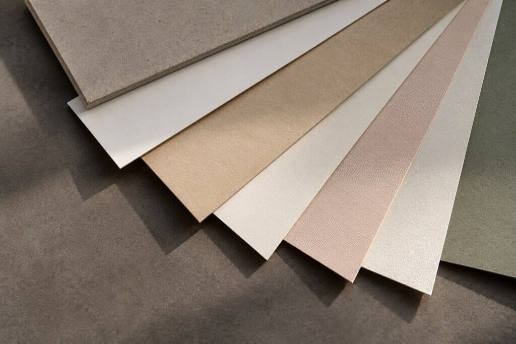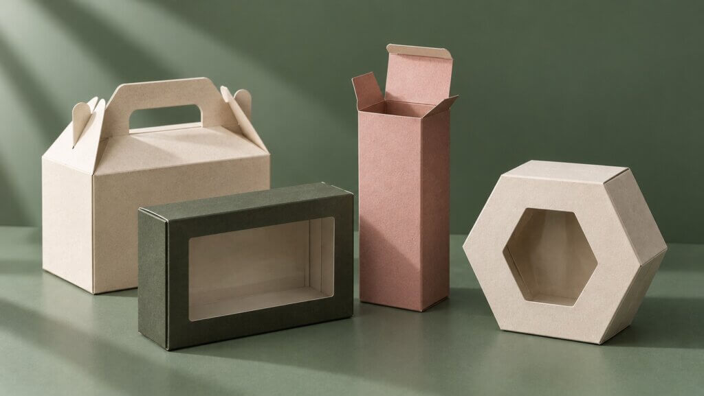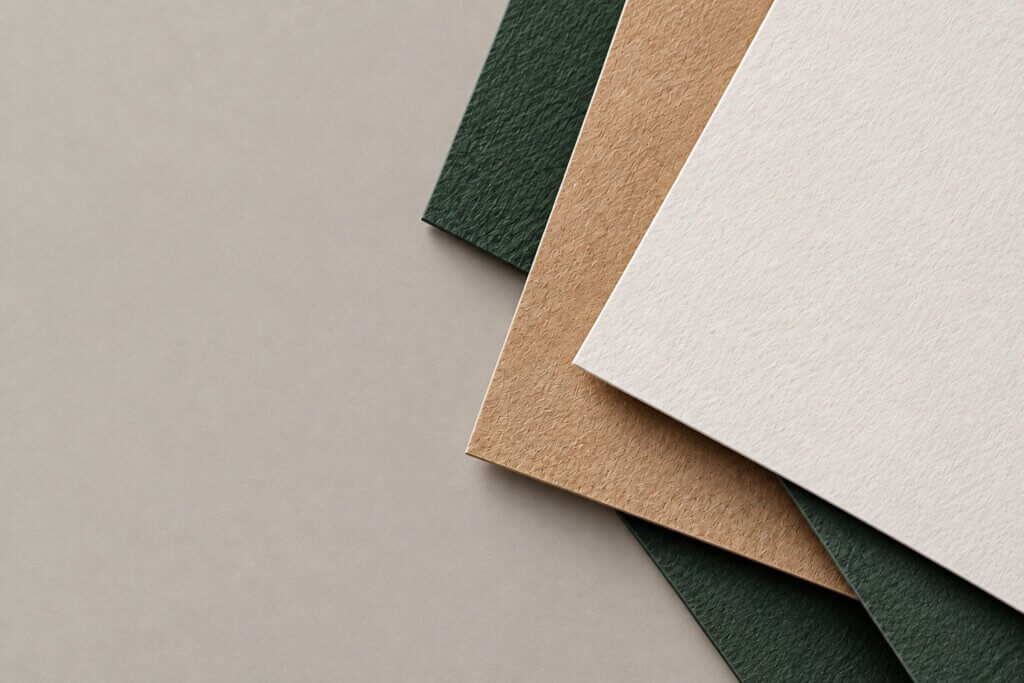

A paper sample can look excellent on its own and still be the wrong choice for a finished package.
This happens because paper is rarely used by itself. Once selected, it has to go through printing, foil stamping or embossing, and then through converting processes such as die-cutting, creasing, folding, wrapping, or assembly. Each step changes what matters about the material.
For custom packaging , we therefore prefer to evaluate paper as part of the complete package rather than treating it as a decorative decision made at the beginning of the project. The same principle applies whether the project involves folding cartons , drawer boxes , or another paper-based structure.
This becomes particularly important when the design depends on foil, printing, or relief. With custom embossed boxes, for example, choosing a thicker or more expensive paper does not automatically create a cleaner embossed result. With kraft paper gift boxes, the natural paper color becomes part of the printed design rather than simply sitting underneath it.
The better starting point is the finished package: what needs to print clearly, which areas need to catch light, where tactile detail matters, and what the material still has to do after the surface decoration is complete.
Paper Choice Starts With the Finished Package
When comparing paper samples, it is easy to focus on color and touch. In production, we need to look beyond those first impressions.
The base color of the sheet affects printed color. Surface smoothness affects how fine graphics appear. Texture can influence the visual character of foil and embossed areas. Thickness and stiffness affect how the material behaves as part of the package. Grain direction and surface treatment can become important later when the sheet is scored, folded or wrapped.
These properties also interact rather than working independently.
Consider a natural kraft sheet. Its brown base may be exactly what a brand wants for kraft paper gift boxes, but that base also changes how printed colors are perceived. A pale color developed against a white screen or white proof may become less bright when printed directly onto kraft. Darker graphics may remain strong, while subtle tonal differences can become less obvious.
The solution is not necessarily to replace kraft with white paper. It may simply mean changing the artwork, ink approach, or expectations to work with the chosen substrate.
The same reasoning applies to custom tea boxes and custom chocolate boxes packaging. A tea brand with restrained typography and limited colors may benefit from an uncoated or lightly textured material. A chocolate package built around detailed illustrations or controlled color reproduction may require a different surface. Neither material is inherently more premium; they are solving different visual and production requirements.
This is why we do not consider GSM alone enough to specify a paper. Two papers with similar weight can have different stiffness, surface characteristics, bulk, fiber composition, and converting behavior. The number on the paper specification is useful, but it does not describe the entire material.
Paper selection becomes more reliable when the question changes from “Which sample looks better?” to “Which material still works after the artwork, finishing, and structure are added?”
The Same Paper Surface Changes Printing, Foil, and Embossing in Different Ways
Printing is usually the first place where the relationship becomes visible.
A white, relatively smooth surface gives printed graphics a different starting point from natural kraft, colored stock, or heavily textured paper. Ink behavior also differs between coated and uncoated surfaces, so the same color specification should not automatically be expected to look identical across different materials.
For custom packaging for jewelry, this can matter even when very little ink is used. If the design consists of a small wordmark, fine linework, and a large area of exposed specialty paper, the material itself becomes one of the dominant visual elements. The graphic and the substrate have to be judged together.

Foil stamping introduces a different requirement.
During hot foil stamping, the foil has to transfer to the selected surface under controlled heat, pressure, and contact. On a relatively smooth sheet, the die can contact the surface more continuously. A heavily textured paper contains small peaks and recesses, so the same foil artwork may not behave in exactly the same way.
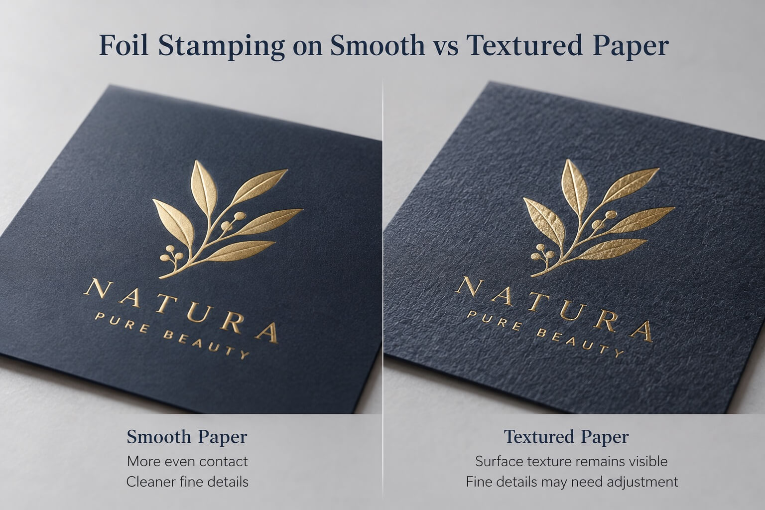
This does not mean textured paper cannot be foil stamped. It often can.
The more useful question is whether the combination of that paper, that foil, and that artwork produces the intended result.
A simple logo with stronger lines may perform well where extremely fine lettering becomes less predictable. A small metallic mark and a large solid foil area also present different production conditions. Large solid areas need visually even transfer across a wider surface, while fine details depend heavily on edge definition.
Embossing adds another variable because the paper is no longer only receiving something on its surface—it is being physically formed.
This is where a common question such as “What paper is best for embossing?” becomes difficult to answer with a single material recommendation. The result depends on the paper, but also on the size and geometry of the artwork, the tooling, the desired relief, and whether other processes need to register with the embossed area.
For custom embossed boxes, a bold symbol and a very small serif wordmark should not automatically receive the same embossing specification. A larger, simpler form generally gives the material more room to create a readable raised profile. With fine artwork, pushing for greater depth can reduce definition rather than improve it.
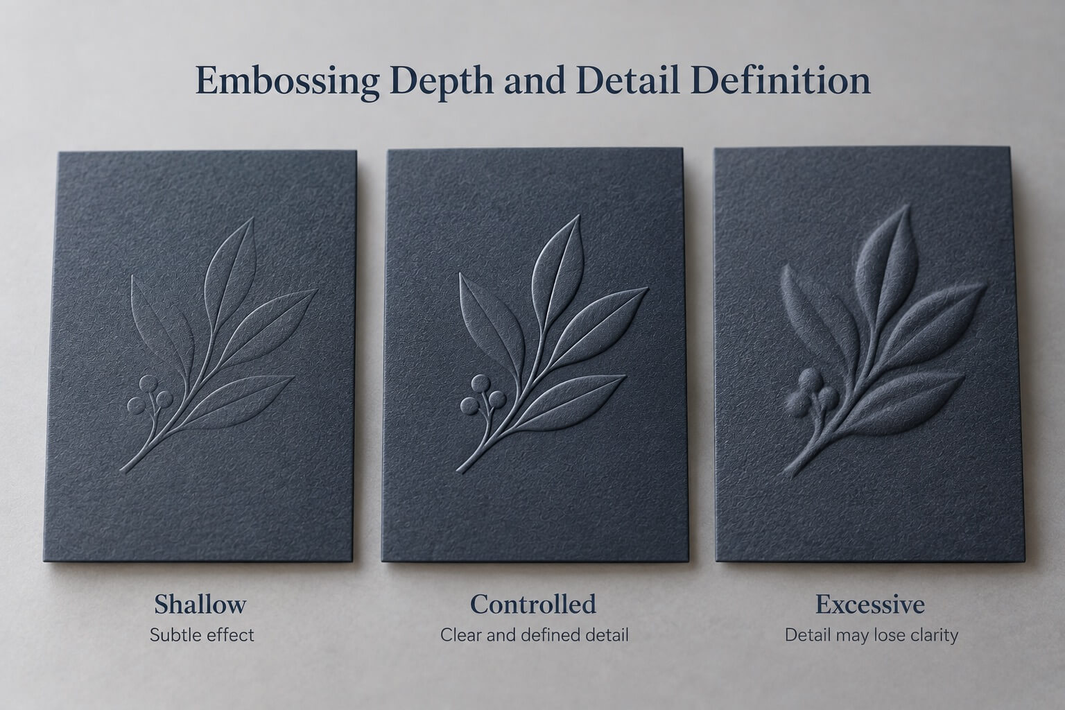
Deeper embossing does not automatically mean better embossing.
What matters is whether the raised area remains clean and intentional at normal viewing distance and under normal lighting.
The same principle explains why foil and embossing can work beautifully together but require more control when they occupy the same graphic. The metallic area and raised profile need to align closely enough to read as one element. As the artwork becomes smaller or more detailed, visible registration differences become less forgiving.
This is also why we prefer to evaluate important combinations on the actual paper instead of approving them entirely from a digital rendering.
A Good Surface Result Still Has to Become a Box
One of the easiest mistakes in material selection is approving a paper because a flat printed or finished sheet looks good.
The sheet is not the finished product.
A folding carton still needs to be die-cut, scored, folded and glued. A rigid box needs decorative paper to wrap around structural board, corners and edges. A cylindrical box introduces curvature and a seam. A drawer box has two wrapped components whose dimensions must still work together after assembly.
This means the paper has a second job after printing and finishing: it has to survive converting.
Grain direction is one example. Paper does not behave identically in every direction because of the way fibers become oriented during papermaking. Depending on the paper and construction, the relationship between grain direction and a major fold can affect fold behavior and the risk of an unattractive surface break. Crease design, board thickness and surface treatment also influence the result, so grain should be considered as part of the converting setup rather than as an isolated rule.
Dark printed areas can make this particularly visible. A flat sheet may look completely acceptable, while a poorly matched crease and fold exposes lighter fibers or creates a noticeable break along the surface after folding.
Wrapped rigid packaging introduces different concerns. For round gift boxes wholesale, the decorative sheet needs to follow a curved body and meet at a controlled seam. A foil mark or embossed detail that looks correctly positioned on the flat artwork may feel misplaced once the sheet is wrapped if the visible area, curvature, or seam has not been considered.
sliding boxes create another practical example. Decorative paper is wrapped over structural board, so the finished construction is affected by both the board and the wrap. The paper specification, adhesive, wrapping process, and dimensional allowance all contribute to the final fit. If the tray and sleeve are already designed with insufficient clearance, changing the wrap or finish without considering the structure can affect how smoothly the drawer moves.
This is why a beautiful material sample and a suitable production material are not always the same thing.
A paper has to look right, accept the required finishes, and still behave correctly when converted into the intended structure.
Different Packages Put Different Demands on the Paper
Paper decisions become easier when they start with the product and package format rather than with a list of fashionable materials.
Take custom essential oil boxes. A small glass bottle may use a compact folding carton with a paper insert. Because the carton is relatively small, fine folds, narrow panels, printed information, and finishing may all sit close together. A paper that looks impressive as a large sample still needs to crease and fold cleanly at the actual carton dimensions.
A jewelry package creates another set of priorities. The box may expose more of the decorative paper and use only a small logo, so surface texture, foil definition, and tactile quality can carry more visual weight than complex printing.
With influencer boxes, larger presentation surfaces often change the balance again. Broad printed areas, inside printing, photography, and overall color consistency can matter more than extremely fine embossing. A material should therefore be judged at the scale at which it will actually be seen.
Even buyers looking for custom flower packaging suppliers may need very different materials depending on what “flower packaging” means for the project. A rigid round flower box, a folding carton for preserved flowers, and a paper carrier have different structures and production methods. Choosing the surface paper before defining the package format reverses the development process.
The same idea applies across tea, chocolate, jewelry, cosmetics, fragrance, and gift packaging.
Product category can suggest a visual direction, but it does not determine the paper specification.
Instead, the product tells us what the package has to do. The structure determines how the material will be converted. The artwork determines what needs to reproduce clearly. The finish determines what the surface must accept.
Only then does the paper choice become meaningful.
Sampling Connects the Design Decision to Mass Production
A digital rendering is useful during development. It can show proportions, artwork position, approximate colors, and the intended location of foil or embossing.
What it cannot show accurately is how a real sheet behaves.
It cannot fully reproduce the base color and light response of a particular paper. It cannot tell us whether a fine foil line transfers cleanly on a pronounced texture. It cannot show exactly how an embossed edge will form, or whether a coated surface will remain clean around a demanding fold. It also cannot confirm whether wrapped components will still fit correctly after assembly.
A physical sample is therefore most valuable when it is treated as a test rather than simply as a presentation piece.
For printing, we can judge whether the color and detail work on the actual substrate. For foil, we can inspect transfer, edges, small elements, and solid areas. For embossing, we can evaluate definition and relief. Once the package is converted, we can also check folds, edges, seams, wrapped corners, assembly, product fit, and opening behavior.
This becomes particularly important when several processes interact. A paper may print well and foil well independently, yet a registered foil-and-emboss detail may still require adjustment. A surface may look excellent while flat but become less successful after a tight fold. A drawer-box wrap may look correct but reveal that the structural clearance needs adjustment after assembly.
Before mass production, the goal is therefore to lock the combination rather than approve each component separately: the actual paper, printing requirement, foil or embossing artwork, relevant tooling result, and the finished structure.
That is also why there is no universal “best paper” for premium packaging.
The right paper is the one that can carry the design through the entire process—from printing and finishing to folding, wrapping, assembly, and repeated production—without forcing the package to compensate for the material later.
When paper is selected this way, it stops being a decorative layer.
It becomes part of how the package is engineered.